The primary goals of the application’s user interface (UI) and user experience (UX) design are to provide a seamless and intuitive financial services experience to a diverse audience. I aimed to achieve this by incorporating a modern and minimalist design that is aesthetically pleasing and environmentally friendly.
To ensure that our design meets the needs of our users, we conducted extensive qualitative and quantitative research. Our qualitative interviews provided us with invaluable insights into the UX challenge and customers’ wishes.
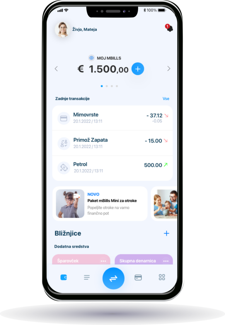
To enhance the user experience, we incorporated 3D minimalist animations that are both visually appealing and provide clear and easy-to-understand representations of the app’s functions. Additionally, we personalized the home screen with shortcuts to make it easier for users to access the features they use the most, increasing efficiency and convenience.
Black mode
Our commitment to our users’ needs is reflected in our response to customer feedback. We added a popular feature, the black mode, which is ideal for users who prefer a darker color scheme. By prioritizing user experience and feedback, we aim to provide all our users with a user-friendly and satisfying financial services experience.
STYLE GUIDE
A color theme for everyone
The primary colors of the application are a blue gradient, its transparency, gray, and an orange-red gradient. Blue communicates trust, stability, and productivity. Bright blue is an action color with guaranteed success. Blue, together with white and light gray, gives a sense of freshness and has a calming effect on the mood. Orange-red appears as a color of alerts and notifications and grabs attention. By choosing these colors, we want our users to feel trust, stability, productivity, and ease of use.
STYLE GUIDE
Nunito Sans
in Action
As part of the UX/UI redesign of the mBills mobile wallet, I selected Nunito Sans for its rounded, modern form that reflects the app’s core values: simplicity, security, and trust.
Its excellent readability on small screens ensures clarity and ease of navigation, which is essential for a seamless day-to-day financial experience.
With its neutral yet friendly character, the typeface supports a clean visual hierarchy and minimalist interface, enhancing user confidence and overall usability.
STYLE GUIDE
Flat icons
Our new icons are stylized for a polished look and feel. With an outlined design, we create a sense of modernity and freshness, while adjusting line thicknesses based on size makes coding much simpler. Furthermore, some of the icons are animated in the SVG format to add even more noteworthy appeal.
STYLE GUIDE
Animated icons
In addition to flat animated icons, which mainly indicate the beginning or end of an action, we have animation on introductory informational screens. These are 3D designs and are intended to encourage users to explore specific features and functions.